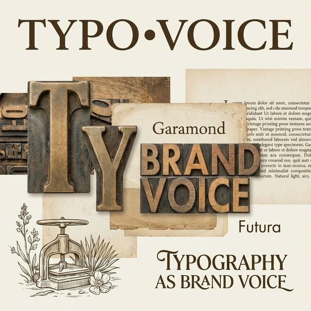
Long before a customer reads your brand's message, they experience your typography. The fonts you choose speak volumes about who you are, what you value, and how you want to be perceived—often communicating more powerfully than the words themselves.
The Psychology of Letterforms
Typography is far more than a functional necessity for communicating written language. Each typeface carries psychological weight, historical associations, and emotional connotations that shape how audiences perceive your brand. A serif font whispers tradition and authority. A geometric sans-serif proclaims modernity and efficiency. Script typography suggests elegance or playfulness, depending on its execution.
At Loiste Studio, we view typography as the most fundamental element of visual identity—the voice your brand uses before it speaks a single word. Just as you wouldn't hire a spokesperson without considering their tone, demeanor, and presence, you shouldn't select brand typography without deep consideration of the personality it projects.
The Anatomy of Typographic Personality
Understanding typography's communicative power begins with recognizing what makes different typefaces feel distinct. Is the x-height tall or short? Are the terminals (stroke endings) rounded or sharp? Is the contrast between thick and thin strokes dramatic or uniform? Each of these technical characteristics contributes to the overall personality a typeface conveys.
Consider how differently these characteristics manifest in practice. A humanist sans-serif like Gill Sans, with its slight variations in stroke width and open apertures, feels approachable and warm. Contrast this with a neo-grotesque like Helvetica, whose mathematical precision and neutral character project efficiency and objectivity. Neither is inherently better—they simply speak in different voices to different audiences.
Typography doesn't just carry your message—it IS the message. The voice you choose reveals as much about your brand as the words you speak.
Strategic Typography in Brand Building
Effective brand typography requires more than aesthetic preference. It demands strategic alignment between typeface characteristics and brand positioning. A luxury fashion brand choosing Comic Sans would create cognitive dissonance, just as a children's toy company using austere modernist typography might feel cold and uninviting.
The most successful brand typography systems achieve three critical objectives: differentiation, appropriateness, and flexibility.
Differentiation Through Type
In crowded markets, typography offers a powerful differentiator. When your competitors all use similar typefaces, choosing something distinctive—yet appropriate—can set you apart before your brand name is even recognized. This doesn't necessarily mean choosing the most unusual typeface available. Sometimes differentiation comes from unexpected pairings or unconventional applications of familiar faces.
We recently worked with a luxury hospitality brand operating in a sector dominated by classic serifs and script typography. Rather than following convention, we selected a refined geometric sans-serif paired with a sophisticated slab serif for headings. The combination felt fresh yet premium, modern yet timeless—perfectly capturing the brand's position as contemporary luxury rootedin tradition.
Cultural and Contextual Appropriateness
Typography doesn't exist in a vacuum. Typeface perception is influenced by cultural context, historical associations, and current design trends. A typeface that feels cutting-edge in San Francisco might appear dated in Tokyo. What communicates authority in financial services might feel stuffy in creative industries.
This cultural dimension extends beyond geography. Different sectors have established typographic languages that audiences have learned to interpret. Healthcare brands often favor humanist typefaces that balance professionalism with approachability. Technology companies frequently choose geometric sans-serifs that project innovation and precision. Understanding these conventions allows you to either align with expectations or strategically subvert them.
Building Typographic Systems
Brand typography rarely lives in isolation. Modern brands require typographic systems—families of typefaces working in concert to handle diverse communication needs while maintaining visual coherence. A robust typographic system typically includes at least a primary brandmark face and a secondary text face, often supplemented with display faces for special applications.
The Primary-Secondary Relationship
The relationship between primary and secondary typefaces defines much of your brand's visual rhythm. Pairing a distinctive display face with a neutral text face lets you make bold statements while ensuring readability in longer content. Conversely, using variations of a single type family (like different weights of theame sans-serif) creates unity through consistency.
At Loiste Studio, we often advocate for contrast over similarity in primary-secondary pairings. A refined serif paired with a clean sans-serif creates visual interest and functional clarity—the serif elevates key moments while the sans-serif handles utilitarian needs. However, this isn't a universal rule. Some brands benefit from the cohesion that comes from using a single, versatile type family throughout.
Hierarchy and Scale
Typography's communicative power multiplies when you consider hierarchy and scale. The same typeface can project entirely different personalities at different sizes. A delicate hairline serif might appear sophisticated and refined in large display applications but become illegible and fragile at small sizes. Understanding how your typography performs across scales is essential.
We develop detailed typographic hierarchies for our clients—specifying not just which faces to use where, but exactly how to scale them, space them, and combine them for maximum impact and clarity. This level of specification ensures consistency while providing enough flexibility to handle unexpected communication needs.
Typography in the Digital Age
Digital platforms have revolutionized typographic possibilities and challenges. Variable fonts allow a single file to contain multiple weights and styles, enabling responsive typography that adapts to context. Web font services provide access to vast libraries, democratizing quality typography. Yet this abundance creates new challenges in selection and implementation.
Performance and Accessibility
Digital typography must balance aesthetic ambition with technical reality. That beautiful custom typeface might devastate your website's load time. Your carefully chosen script font might fail accessibility standards for readers with visual impairments. These aren't reasons to abandon distinctive typography, but they demand thoughtful implementation.
We approach digital typography through a progressive enhancement lens. Core content uses highly legible, efficient system fonts that load instantly. Then we layer in custom brand typography strategically—for headlines, key messages, and brand moments where the impact justifies the overhead. This ensures everyone gets a functional experience while brand-conscious users enjoy the full typographic richness.
The Future of Brand Typography
Looking ahead, typography's role in brand identity will only intensify. Variable fonts enable responsive typography that adapts to viewport, usage context, and even user preferences. AI tools can generate custom typefaces aligned with brand guidelines. Kinetic typography brings motion to letterforms, adding temporal dimension to typographic personality.
Yet amid these innovations, the fundamental principles remain constant. Typography is voice. Your choices communicate before you speak. The question isn't whether to invest in strategic typography—it's whether you can afford not to.
Conclusion: Speaking with Intention
Every brand speaks. The question is whether you're choosing your voice intentionally or allowing it to emerge by default. Typography gives you precise control over how your brand sounds—from authoritative to playful, from traditional to innovative, from warm to clinical.
At Loiste Studio, we believe exceptional brand typography comes from understanding both the technical craft and the strategic imperative. It requires knowing how typefaces are constructed, how they perform across contexts, and how they're perceived by different audiences. Most importantly, it demands alignment between typographic voice and brand truth.
Your typography is speaking. The question is: what is it saying?